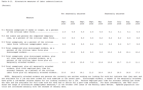
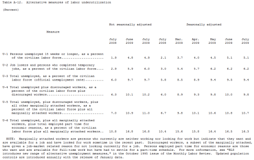
Below is the A12 chart from the Bureau of Labor Statistics. This chart gives the full unemployment picture of what is going on in the United States. These numbers cover a lot of varying categories and are often referred to but not always shown in full.
Unfortunately at this point it is still not a pretty picture, I do not expect to see any decrease in these numbers until the first half of 2010. That said, I.T. and Manufacturing are two burgeoning sectors of growth albeit they are not wide spread across every state. We are beginning to build toward hiring trends that will go beyond state borders, once that begins there will definitely be more companies willing to put both feet in and start hiring again.
Click Picture to enlarge.


